
Lote Tuqiri reckons the new Broncos logo "doesn't scream toughness" and fellow Brisbane premiership-winning hero Steve Renouf believes the horse's head looks "trapped".
Another premiership-winning Brisbane star of yesteryear, champion outside back Brent Tate, reckons the new logo is "pretty slick-lookin'" and thinks highly of the meaning behind it — but he's turned his nose up at the dropping of the word "Broncos".
The Broncos on Wednesday unveiled their first brand refresh since 2006, revealing a new logo described by Adam Reynolds as "special" and introducing a battle cry: We charge on.
READ MORE: Stuart's arms open as young Bronco pushes for early release
READ MORE: 'Costly' word that outrages an entire nation rocks cricket game
READ MORE: England 'bingo' backfires as grim Crawley stat laid bare
The new logo features a forward-facing Bronco, a shield nodding to the club's original logo from 1988, and the Brisbane River.
Notably, the word "Broncos" is gone and the word "Brisbane" has been shifted to the top of the logo.
The Broncos, who enlisted the brains of global brand agency DDB Group for the refresh, are clearly wanting to ward off the Dolphins as the NRL's newest club tries to encroach on their turf.
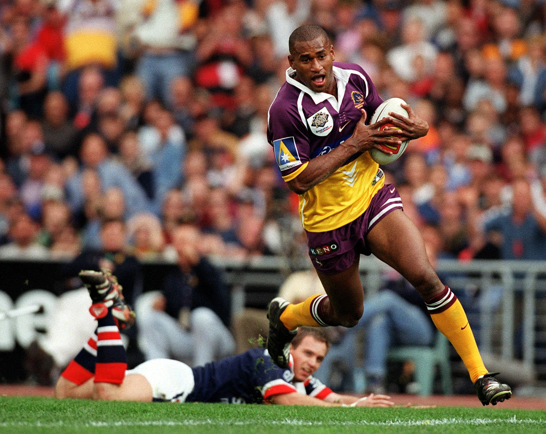
Tuqiri, a star of the Broncos side that won the NRL title in 2000, panned the rebrand in a chat with Wide World of Sports.
"It doesn't scream toughness, I don't think. This is a new era and it's got off to a good start [with this year's NRL and NRLW grand final wins]. It's a bit weird; they've spent a lot of money on something that looks pretty plain. It looks a bit like that chess piece, the knight," Tuqiri said.
"When you look at the Broncos and the history of the logo, it shows innovation, but this seems to be going with the flow rather than something different.
"The original [logo] from 1988 — I love that, the Bronco coming out of the shield."
https://x.com/brisbanebroncos/status/1993398655823626483https://x.com/brisbanebroncos/status/1993402925989904841
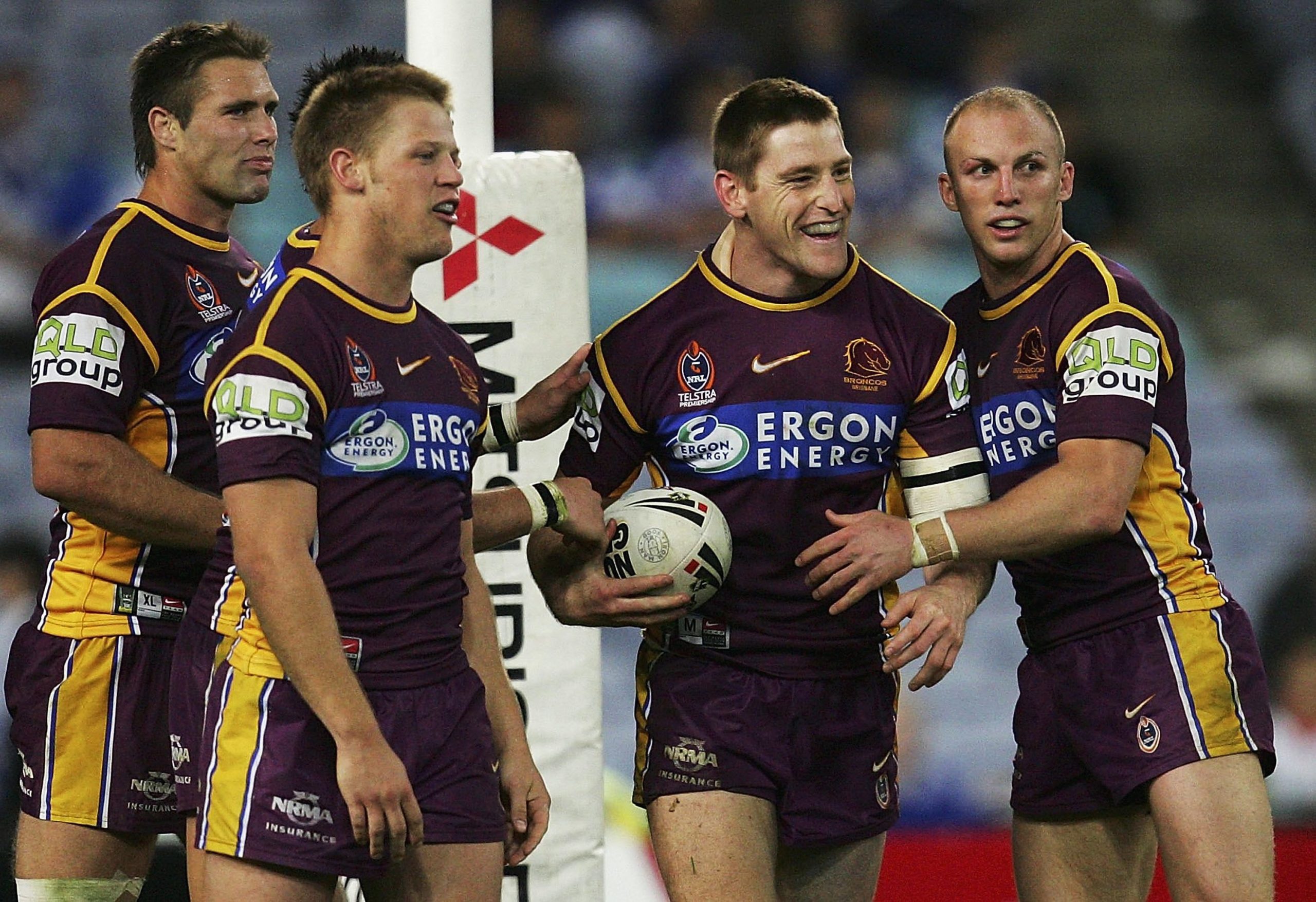
Renouf was a member of four premiership-winning Brisbane teams in the 1990s, all of which played in the era of the original logo, featuring a shield, the words "Brisbane Broncos" and a golden, galloping horse glancing behind.
"If you want me to look at it with the part of my brain that's marketing, it looks like there's a horse head trapped inside whatever that is," Renouf said of the new logo in a chat with WWOS.
"It doesn't look free.
"I like the previous one, and that's not saying I hate this one, which I don't.
"I thought the previous one was quite smart, sharp and an upgrade on the original one.
"I liked that [the original one] and I played in that."
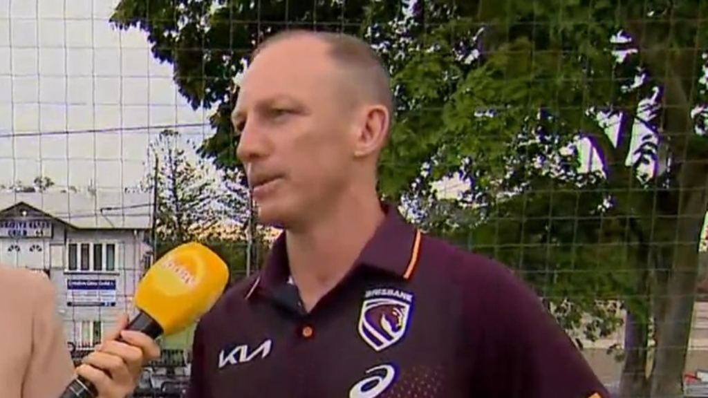
Tate, who played in the Broncos side that won the NRL premiership in 2006, largely spoke positively of the rebrand.
"I like it. I think it's pretty good … I think the outcome looks good on the jersey and I like the description behind it," Tate told WWOS.
"I think as a player, to be a part of that significant change in the history of the club is pretty good.
"I think the representation about the Brisbane River, recognising the past and where they want to go is all very good.
"It's pretty slick-lookin' if you ask me."
Darren Lockyer, a Broncos board member and Brisbane's captain at the time of the previous logo change, admitted in an interview on Nine's Today on Wednesday that the "Broncos" element had been "diluted".
"It's probably the only one criticism I've got," Tate said, referring to the culling of the word "Broncos".
"It's a pretty powerful symbol, Broncos, or the wording of the 'Broncos' … The Brisbane Broncos is a pretty powerful brand, and people don't talk about them being Brisbane — they talk about them being the Broncos.
"But I think it's good to do a refresh and rebrand and recalibrate."
Many Broncos fans responded with anger to the rebrand, which according to News Corp cost $300,000.
"If we want to make a statement plz [sic] I urge everyone who's a TRUE supporter to boycott anything with this shit on it," one fan said in a Broncos supporter Facebook group.
Another Broncos fan even launched a petition in a bid to have the rebrand cancelled. He dubbed the petition Revert Brisbane Broncos Logo.
"There's going to be people that love it, there's going to be people that hate it," Tate said. "That's just the world we live in."
Leave a Reply
You must be logged in to post a comment.